


HERE.FM
I was brought in as Product Designer to shake up this funky chat app. Here.fm was already 3 years old and known for it’s robust video-chatting features but its growth was stunted. I devised a game plan to expand friend graphs, increase retention and improve DAUs. While a largely unorthodox example of product design for various reasons (quirky product, willingness to take big risks, very young audience, etc.) Here.fm was an incredible learning experience as my first full-time product role.
UX/UI, Product Design, 3D Animation
DMs sent per user increased by 20%.
Retention of users sending a DM increased to 37%.
Profile views month over month increased by 10%.
Friend requests increased by almost 60%.
(having a friend was the biggest factor for retention).
My impact at Here.FM:
Week 1 retention increased by 12% from April to May post redesign launch.
Total messages sent per user increased by 6% in that time frame.
Customizing user cards increased by an insane 30%.
Conducted user research through Fullstory, Mixpanel and in-person interviews
Completed massive site audit and IA restructure
Worked closely with engineers to ensure pixel-perfect design implementation
Expanded the Here.fm design system and brand
Responsibilities:
Initial Here.FM Audit
I began my masterplan by considering the stats from Here.FM’s most beloved features and drafting a Here that would break these features out of the current bogged down flow and champion them, improving usage and retention.
Users love making cards.
Users love decorating VC rooms.
= Push Customization
Users are only in 1-3 group chats.
Users do not use the GC wall.
= Rethink Async Use
Users idle on the DMs page.
Users DMs WAY more than GC.
= Condense GCs and DMs
Users LOVE video chat when they use it but VC usage is very low.
= Deprioritize Video Chatting
The old Here.fm before I took the reigns.
As a returning user, you were thrown into the last active group chat. This made no sense to me. There was no place to exist outside of a GC.
“Profile Cards”, a cute feature that proved to heavily influence retention, was super hidden and had no shareability.
“Video Chat decoration”. Numbers showed that if someone took their time to actually decorate a video chat “room”, they’d be hooked and would almost certainly invite a friend to the app to try it. But video is not something users do daily.
Doubled group chat text spaces. Users weren’t using the “walls” in “hubs” like the async space for a video chat it was intended to be and instead would rather privately DM and idle on the DMs screen.
Video Chat Rooms were heavily pushed, existing in the Nav bar and each group chats header- but video chat is not a behavior we could get users to do more than just now and then- certainly not enough to retain them. The app needed more asynchronous activities.
When broken down into wireframe.
Groupchats and DMs are essentially the same thing, though most users weren’t part of many group chats and would mostly use DMs— but in this original design, GCs are broken off as the main functionality of the site.
“wall chat” and “normal chat” are also essentially the same thing— except in the normal chat, messages appeared linearly like a messenger and on the wall, the messages could be moved and rearranged like stickers. We know users never got the hang of using the wall- even after years.
and the list goes on…
TLDR:
The old Here.fm was built around video chatting as its core function— but its user base wanted a chat-first app. This led to many redundancies which confused users and bogged down the architecture. It needed restructuring in a BIG way.
Complete Here.FM Overhaul
With this audit complete, I now had a roadmap from which to build around! My vision for the future here.fm was a fully customizable landing pad with friend activity upfront and to give everything a sharable avenue.
We knew once users began to decorate a VC room they had the highest return rate.
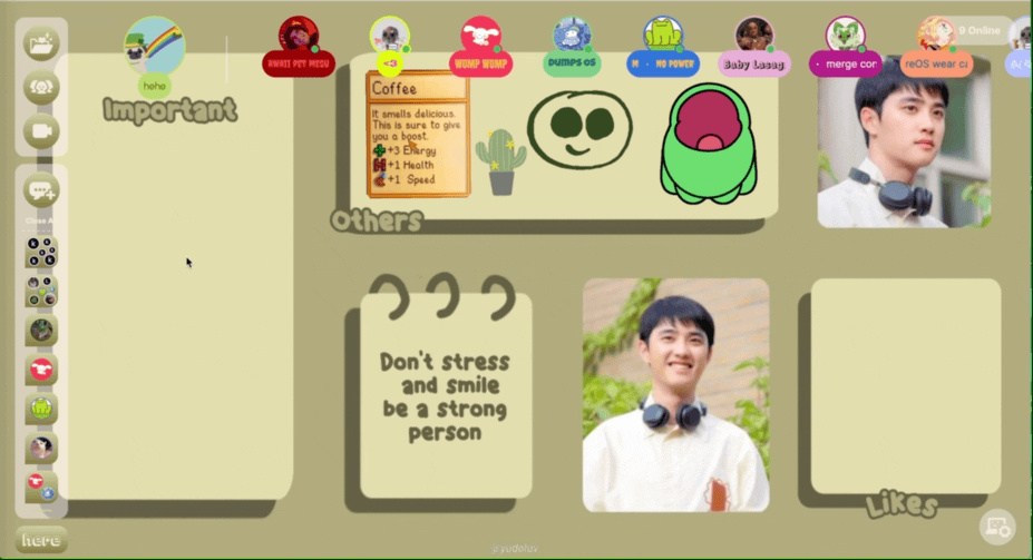
In my new design, users were immediately dropped into a decoratable space, something they could do alone and then share to bring in a friend.

New Here.fm landing after onboarding completion
While this may seem like a huge jump from the previous Here.fm, it includes all the parts needed: Immediate single-player customization to gear the user up for multiplayer, clear directions of app use and purpose, and many fun ways to show off and be yourself.
New Here in Use
The most satisfying part of a redesign, of course, is seeing users fully understand what to do right after onboarding. We got so much positive feedback from this redesign.

Not to toot my own horn but my own Here desktop was so0o0o cute~
We saw users create custom backgrounds to organize their chats and VC room shortcuts before we even introduced templates or samples!

We saw users create themes around their interests and even make voice chat rooms to match them.
Push Customization
Here.fm had so many quirky customization tools that went unknown. By putting them upfront in your user profile and making that sharable we were able to show off the hidden capabilities and also give users tools to show off who they are and what they’re about.
Rethink Async Use
Condense GCs and DMs
Groupchat walls and regular chats were absorbed into one. With the “wall” aspect now functioning like ios stickers alongside linear text. This meant now chatting could exist in one space.
Deprioritize Video Chatting
This was the biggest jump. Unfortunately, users just cannot be convinced to VC more than 1-2 times a week tops. Nor would these video-chatting users return for anything else. We decided to focus on making the BEST chatting experience first— with video being the delightful surprise.
For the V1 of this implementation, we focused on education and making sure users could still navigate the site as intended with such a big shift. We made very small tweaks, eventually adding a feedback button to get a direct line for such a big change.
Public Chats
Now that we bolstered the individual profile, set the purpose of the app as socialization, and made sharing the app with friends easier— my next big goal was to expand friendgraphs via making new friends on the Here.fm platform itself. The challenges here were safety, distinction between public and private, and chat moderation.
Safety First!
In order to keep users safe, we had to make sure reporting and banning bad users was intuitive enough for kids to do. We started by first gating public chats and allowing access only to users who have completed the post-onboarding tutorial and filled their profile out entirely.
On top of that, we also made it so only users that had a verified phone number could participate in public chats.
Everything in Moderation
For our V1, we had public chat creation limited to the topics most requested. That way, we could make sure no bad topics were being posted- at least until we could get users to get used to moderating and banning on their own.
We also added a rules page for each public chat before joining, This would later be customizable with the admins own additional rules too.


Icons & Other Miscellaneous Designwork
While the app was designed to be fully customizable to suit the user, we still needed a Here.fm brand to keep the wayfinding uniform. I created all of the icons seen throughout the site to be soft, with a rounded edge to give the app a cute and young vibe.

Buttons that opened new windows on your desktop were customizable in color way.

Icons for the new site launch.
New quirked-up landing page
I designed a new landing page to champion messaging as the apps core function. Focusing on our most user retaining feature, in which users could use cross-platform, reduced over-all confusion and emphasized the personalization aspect.
I would never waste the opportunity to throw in a little extra motion and 3D!
Designing for Kids
Every “Teen Tuesday” I met with a small cohort of kids from partnering high schools and observed them use our app. This was vital because the in-app feedback button I implemented would just get “how to watch anime?” and Mixpanel stats also can only show you so much. Kids are also brutally honest. They have no filter or niceties.
Old boring landing page
Challenges
Designing for the Very Young
Due to its design at inception 3 years prior to my start, Here.fm had attracted mostly users between between 10-15. This meant my designs had to be centered around a much younger audience than I’ve ever been used to! Safety was paramount.
Clunky Onboarding Flow
Sign up took forever, did a poor job of explaining the app’s main functions and upon onboarding completion you are just dumped into its most heavy feature, video chats, with no one to explore a multiplayer mode with and a difficult way to exit.
Sterile Site Map
I was handed the keys to what felt very much like a coding exercise. For such a quirky app, too much focus was put on utility and not enough thought put into the feel or whimsy of the app. Fun features felt hidden. Core use wasn’t championed. Users wanted more customization, more ways to show off who they are!